I have been working with WPF lately and I’m really impressed with the style capabilities. From a high level our goal when using styles is to be able to set some standard properties of various controls one time in one place and have them affect many or all of the controls of that type in our window or application.
Let’s start with a really basic window and a hand type a few controls.
- <Window x:Class="Lesson1Styles.Window1"
- xmlns="http://schemas.microsoft.com/winfx/2006/xaml/presentation"
- xmlns:x="http://schemas.microsoft.com/winfx/2006/xaml"
- Title="Window1" Height="300" Width="300">
- <Grid>
- <Label Margin="0,25,0,0" VerticalAlignment="Top" >
- Style Driven Label
- </Label>
- <TextBox Margin="0,100,0,0" VerticalAlignment="Top">
- Style Driven TextBox
- </TextBox>
- <Button Margin="0,175,0,0" VerticalAlignment="Top" >
- Style Driven Button
- </Button>
- </Grid>
- </Window>
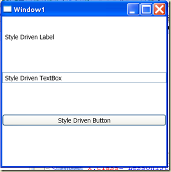
One of the reasons for hand typing the controls is that I chose to only set the margin and alignment of the controls and I didn’t want the designer to add any height and width properties. If we run the application now here is what we see.
Now let’s create a style for each of our controls by adding a Window.Resources element.
- <Window.Resources>
- <Style TargetType="TextBox">
- <Setter Property="Background" Value="Yellow"/>
- <Setter Property="Foreground" Value="Purple"/>
- <Setter Property="BorderBrush" Value="Purple"/>
- <Setter Property="Width" Value="135"/>
- <Setter Property="Height" Value="30"/>
- </Style>
- <Style TargetType="Label">
- <Setter Property="Foreground" Value="Purple"/>
- <Setter Property="Background" Value="Yellow"/>
- <Setter Property="Width" Value="135"/>
- <Setter Property="Height" Value="33"/>
- </Style>
- <Style TargetType="Button">
- <Setter Property="Background" Value="Yellow"/>
- <Setter Property="Foreground" Value="Purple"/>
- <Setter Property="Width" Value="135"/>
- <Setter Property="Height" Value="30"/>
- </Style>
- </Window.Resources>
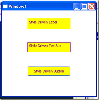
Our new window now looks like this:
Note - I did not have to set a style property on any of the UI Elements. This is because I set the TargetType property in each style and the runtime knew to apply each style to their corresponding controls. Any label, button, or textbox you add to the window will inherit these styles unless you explicitly override the style or individual properties of the style.
It would be highly unusual (ok…ugly) for us to want our labels, buttons, and textboxes to have the same size and color scheme but if we did, it would be nice to not have to duplicate these attributes for each control.
With style inheritance we can do just that. We declare a base style with a TargetType of Control and move all of the common properties into this style. The following refactored code will render the window exactly as we see above.
- <Window.Resources>
- <Style x:Key="baseStyle" TargetType="Control">
- <Setter Property="Background" Value="Yellow"/>
- <Setter Property="Foreground" Value="Purple"/>
- <Setter Property="BorderBrush" Value="Purple"/>
- <Setter Property="Width" Value="135"/>
- <Setter Property="Height" Value="30"/>
- </Style>
- <Style TargetType="TextBox" BasedOn="{StaticResource baseStyle}">
- </Style>
- <Style TargetType="Label" BasedOn="{StaticResource baseStyle}">
- </Style>
- <Style TargetType="Button" BasedOn="{StaticResource baseStyle}">
- </Style>
- </Window.Resources>
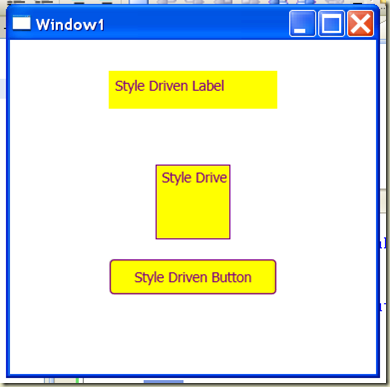
Let’s look at how we can override a portion of the style. If we want our textbox style to have a different height and width than the base style we can simply duplicate the height and width property setter in the style for the textbox and set the value to whatever we want. For example, if we change the textbox style as follows:
- <Style TargetType="TextBox" BasedOn="{StaticResource baseStyle}">
- <Setter Property="Width" Value="60"/>
- <Setter Property="Height" Value="60"/>
- </Style>
Our window looks like this:
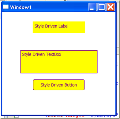
We can even override these properties at the control level. Let’s add a Height property to our textbox control.
- <TextBox Margin="0,100,0,0" VerticalAlignment="Top" Width="200">
- Style Driven TextBox
- </TextBox>
Now when we run, the textbox width is based on the property we set in the control – we override the style defined for the Button which in turn overrides the style we have set for all Controls.
To close things out let’s take a look at adding triggers to a style. If we want all labels to change their background color when the mouse is over the label we can add a Dependency Property Trigger to the style.
- <Style TargetType="Label" BasedOn="{StaticResource baseStyle}">
- <Style.Triggers>
- <Trigger Property="IsMouseOver" Value="True">
- <Setter Property="Background" Value="Gray"/>
- </Trigger>
- </Style.Triggers>
- </Style>
If we want to animate the textbox when the mouse is over the control we can add a Dependency Property Trigger with a StoryBoard and Animation defined. This animation changes the Font Size, height, width, and background color of the textbox.
- <Style TargetType="TextBox" BasedOn="{StaticResource baseStyle}">
- <Setter Property="Width" Value="60"/>
- <Setter Property="Height" Value="60"/>
- <Style.Triggers>
- <Trigger Property="IsMouseOver" Value="True">
- <Trigger.EnterActions>
- <BeginStoryboard Name="story1">
- <Storyboard Duration="0:0:5">
- <DoubleAnimation Storyboard.TargetProperty="FontSize" To="20"/>
- <ColorAnimation Storyboard.TargetProperty="(Background).(SolidColorBrush.Color)" To="Gray"/>
- <DoubleAnimation Storyboard.TargetProperty="Height" To="50"/>
- <DoubleAnimation Storyboard.TargetProperty="Width" To="270"/>
- </Storyboard>
- </BeginStoryboard>
- </Trigger.EnterActions>
- <Trigger.ExitActions>
- <StopStoryboard BeginStoryboardName="story1"/>
- </Trigger.ExitActions>
- </Trigger>
- </Style.Triggers>
- </Style>
Finally we’ll add a Routed Event trigger to the button just to demonstrate the different trigger options.
- <Style TargetType="Button" BasedOn="{StaticResource baseStyle}">
- <Style.Triggers>
- <EventTrigger RoutedEvent="Mouse.MouseEnter" >
- <BeginStoryboard Name="story3">
- <Storyboard Duration="0:0:2">
- <DoubleAnimation
- Duration="0:0:0.2"
- Storyboard.TargetProperty="Height"
- To="90" />
- </Storyboard>
- </BeginStoryboard>
- </EventTrigger>
- <EventTrigger RoutedEvent="Mouse.MouseLeave" >
- <BeginStoryboard Name="story34">
- <Storyboard Duration="0:0:2">
- <DoubleAnimation
- Duration="0:0:0.2"
- Storyboard.TargetProperty="Height" />
- </Storyboard>
- </BeginStoryboard>
- </EventTrigger>
- </Style.Triggers>
- </Style>
We could do all of the styling and animation in code if we want but the good thing about doing this declaratively is if we are not happy with our Minnesota Viking look and feel, we can have a UI designer use a tool like Expression Blend to make things look nice without requiring that they understand code or XAML.
Try adding some other textboxes, labels, and buttons to see what style properties are inherited.
Here is the XAML in it’s entirety:
- <Window x:Class="Lesson1Styles.Window1"
- xmlns="http://schemas.microsoft.com/winfx/2006/xaml/presentation"
- xmlns:x="http://schemas.microsoft.com/winfx/2006/xaml"
- Title="Window1" Height="300" Width="300">
- <Window.Resources>
- <Style x:Key="baseStyle" TargetType="Control">
- <Setter Property="Background" Value="Yellow"/>
- <Setter Property="Foreground" Value="Purple"/>
- <Setter Property="BorderBrush" Value="Purple"/>
- <Setter Property="Width" Value="135"/>
- <Setter Property="Height" Value="30"/>
- </Style>
- <Style TargetType="TextBox" BasedOn="{StaticResource baseStyle}">
- <Setter Property="Width" Value="60"/>
- <Setter Property="Height" Value="60"/>
- <Style.Triggers>
- <Trigger Property="IsMouseOver" Value="True">
- <Trigger.EnterActions>
- <BeginStoryboard Name="story1">
- <Storyboard Duration="0:0:5">
- <DoubleAnimation Storyboard.TargetProperty="FontSize" To="20"/>
- <ColorAnimation Storyboard.TargetProperty="(Background).(SolidColorBrush.Color)" To="Gray"/>
- <DoubleAnimation Storyboard.TargetProperty="Height" To="50"/>
- <DoubleAnimation Storyboard.TargetProperty="Width" To="270"/>
- </Storyboard>
- </BeginStoryboard>
- </Trigger.EnterActions>
- <Trigger.ExitActions>
- <StopStoryboard BeginStoryboardName="story1"/>
- </Trigger.ExitActions>
- </Trigger>
- </Style.Triggers>
- </Style>
- <Style TargetType="Label" BasedOn="{StaticResource baseStyle}">
- <Style.Triggers>
- <Trigger Property="IsMouseOver" Value="True">
- <Setter Property="Background" Value="Gray"/>
- </Trigger>
- </Style.Triggers>
- </Style>
- <Style TargetType="Button" BasedOn="{StaticResource baseStyle}">
- <Style.Triggers>
- <EventTrigger RoutedEvent="Mouse.MouseEnter" >
- <BeginStoryboard Name="story3">
- <Storyboard Duration="0:0:2">
- <DoubleAnimation
- Duration="0:0:0.2"
- Storyboard.TargetProperty="Height"
- To="90" />
- </Storyboard>
- </BeginStoryboard>
- </EventTrigger>
- <EventTrigger RoutedEvent="Mouse.MouseLeave" >
- <BeginStoryboard Name="story34">
- <Storyboard Duration="0:0:2">
- <DoubleAnimation
- Duration="0:0:0.2"
- Storyboard.TargetProperty="Height" />
- </Storyboard>
- </BeginStoryboard>
- </EventTrigger>
- </Style.Triggers>
- </Style>
- </Window.Resources>
- <Grid>
- <Label Margin="0,25,0,0" VerticalAlignment="Top" >
- Style Driven Label
- </Label>
- <TextBox Margin="0,100,0,0" VerticalAlignment="Top" Width="200">
- Style Driven TextBox
- </TextBox>
- <Button Margin="0,175,0,0" VerticalAlignment="Top" >
- Style Driven Button
- </Button>
- </Grid>
- </Window>


Nice tutorial at you can find themes/styles for WPF and Silverlight, check it out
ReplyDelete